International Data Corporation (IDC) forecasts that by 2025 the global datasphere will grow to 175 zettabytes. I am not a mathematician, but that is a lot of data. All this data will unlock more questions than answers, and a new world of business opportunities will emerge. The data explosion is driven by companies’ desire for digital transformation, artificial intelligence (AI), and, in some cases, the Internet of Things (IoT). While I suspect your company is not generating zettabytes of data, the data volume and complexity can still be overwhelming, regardless of the company size and resources.
So, the fundamental questions are:
- How do we focus on the data that is important
- Get that data in the right hands at the right time in the right way to make more informed, real-time business decisions
An effective data visualization strategy becomes critical to answering those questions. Let’s face it, text-based data in the form of Excel spreadsheets, charts, and graphs are not adequate to identify trends and patterns that are necessary to make informed, real-time decisions. Data visualization represents data beyond the spreadsheets, charts, and graphs. It presents information in more sophisticated formats like dashboards, scorecards, graphs, images, relationships, patterns, charts, boxes, infographics, pictorial stories, and maps and it communicates relationships between data elements.
The visual representation of data and relationships is important because, as neuroscience experts tell in books like ‘Proust and the Squid: The Story and Science of the Reading Brain (Wolf, 2007), “We were never born to read.” Education experts also affirm that 65% of the population are visual learners; we absorb and recall information best when we see it. In short, data visualization allows your data to tell a story that leads the visualization consumer to draw conclusions and ultimately make important business decisions.
IDC has noted that worldwide revenues for Big Data and Business Analytics (BDA) solutions were up to $189.1 billion in 2019. BDA revenues are likely to maintain this growth throughout the 2018-2022 forecast with a five-year CAGR of 13.2%. By 2022, IDC expects worldwide BDA revenue will be $274.3 billion. These forecasts show that data visualization is taking center stage at many companies, regardless of size. However, there are still many companies that lack an effective data visualization strategy or are struggling to move past the spreadsheet phase. Let’s take a quick look at some of the pitfalls of not having an effective data visualization strategy.
- Data chaos: Data is everywhere, some structured and, some unstructured, on-premise and, in the cloud, in-house and, at 3rd party vendors, etc. How do we get control of all the data?
- Data relevance: One set of data visualizations do not fit all people and all problems. How do we tailor the visualizations to the relevant role at the right time?
- Data deluge: More data is not necessarily better data. We have become experts at collecting data, but how do we subset the data into relevant slices?
- Data timeliness: Old data is not bad data, but, in today’s time-sensitive world, every second matters. How do we keep data visualizations fresh and current?
- Analysis paralysis: All of the pitfalls above generally lead to one overarching issue: analysis paralysis. How do we get the right data visualization into the right hands at the right time to drive real-time decision making and keep from spinning our wheels?
The Solution
Before we can even begin to think about the visual aspect of data visualization, we first must trust the data that underlies the visualization. According to an Experian report, fewer than half (44%) of organizations trust their data, and C-level executives in general are skeptical, believing that 33% of their data is inaccurate. Data prepping, blending and cleansing the raw data, is step zero for companies that truly rely on their data visualizations to make critical business decisions.
Data Insights
Once we are confident in the quality of the data from various sources, we must search for patterns, dependencies, and relationships to solve the hard questions. This step is what makes data visualization achieve our goal: impact to the business. Forrester calls companies that are turning data into insight “insight-driven businesses”. They also state that these businesses are growing at a rate of 30% year-over-year and are on track to earn $1.8 trillion by 2021. Based on the Forrester research, it is imperative that companies spend time and resources exploring their data relationships to maximize value.
Organizational Needs
Not everyone needs the same level of data access or level of detail in their visualizations. It is important to understand the roles that visualization consumers play, and the level of detail they need, in order to make informed decisions. Typically, the organization needs to break down into three groups, senior executives, mid-level management and analysts. These three groups have vastly different requirements in order to make decisions and get answers to complex problems. Outside of the company’s hierarchy, you must also consider whether the data is relevant to each business function. Spend time understanding what questions those groups need answers to and provide only the relevant visualizations to support their needs. This allows the consumer to stay focused on what is most important to his or her role.
Also Read: Data Visualization for Work from Home
Data Visualization
Once you have data you trust, and understand the patterns, relationships, and what your organization needs, you can begin creating data visualizations to support your company’s initiatives. In my experience, this is typically a very iterative process and can take more time than most people expect. Scope creep generally occurs, because consumers’ understanding of their problem changes. Visualization brings a new perspective to data, no matter how familiar we may be with the data beforehand. Looking at data from a new point of view can more quickly reveal the root causes behind issues you have been reacting to on a regular basis. When companies can use data visualizations to plan for – and proactively solve for – the real issues plaguing their businesses, they begin to make a difference to their bottom lines and their employees. It may take a little more time, but it makes a real impact when to find the answers to questions you never even knew to ask. We have found that taking an Agile approach and treating data visualization creation like a typical software development project (with user stories, backlogs, etc.) is an effective approach to delivering on time.
Wherever you are in your analytics journey it is not too late to build an effective data visualization strategy. If you follow the high-level steps above, I am confident you can avoid the pitfalls described above. Finally, I leave you with this:

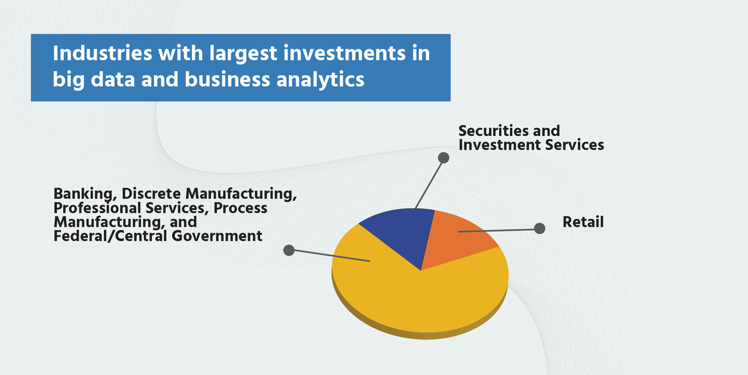
What industries are making the largest investments in big data and business analytics? Are you in here?
- Banking, discrete manufacturing, professional services, process manufacturing, and federal/central government account for nearly half ($91.4 billion) of worldwide BDA revenues.
- Securities and investment services (15.3% CAGR) and retail (15.2% CAGR) are also showing fast growth.
- Retail will be the fifth-largest industry in this reckoning in 2022

