Get Appointment
- contact@wellinor.com
- +(123)-45- 7890
Covid 19 Reports
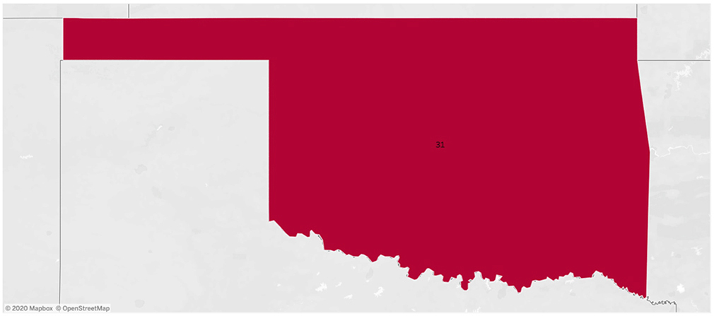
COVID-19: Emergency Room Wait Times by State (in the U.S.)
A dashboard that shows the Emergency Room wait time and average time in different States of the U.S.

COVID-19: Emergency Room Wait Times by Cities (in the U.S.)
A highly insightful and actionable dashboard that shows the Emergency Room wait time and average time by cities in the U.S.
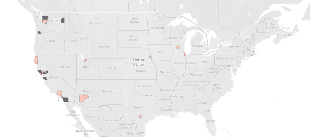
COVID-19 Spread in Top 10 Counties in the U.S
A dashboard that helps users track the spread of covid19 and deaths per million in the top 10 cities of the U.S. The dashboard offers multiple visual ways to arrange the data by State, Race, Counties, and Date.
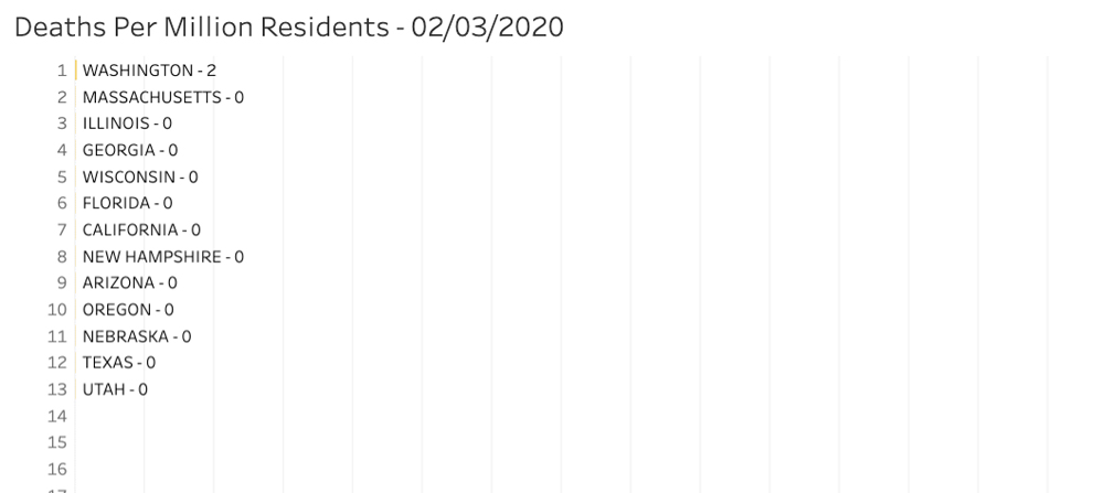
COVID-19 Spread Per Million Residents by States
A dashboard that helps users track the spread of cases and deaths per million residents in all the cities of the U.S. The dashboard offers multiple visual ways to arrange the data by State, Race, Counties, and Date.
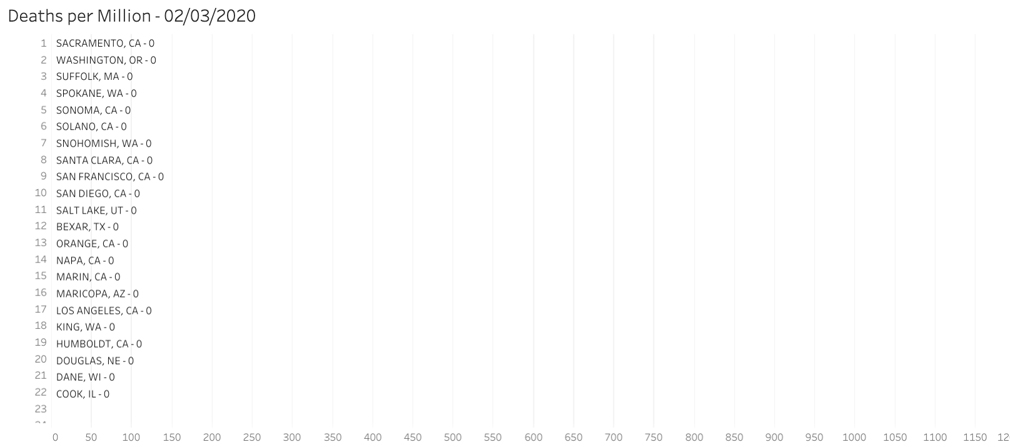
COVID-19 Spread Per Million Residents by Race-Counties
A dashboard that helps users track the spread of cases and deaths per million residents in all the Counties of the U.S. by Race. The dashboard offers multiple visual ways to arrange the data by State, Race, Counties, and Date.
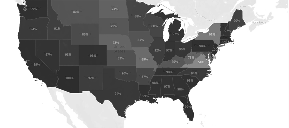
COVID-19 Spread Among the Elderly
A dashboard that tracks the spread of Coronavirus among the most vulnerable population, the elderly, aged 65 and above. It reflects confirmed cases by county.
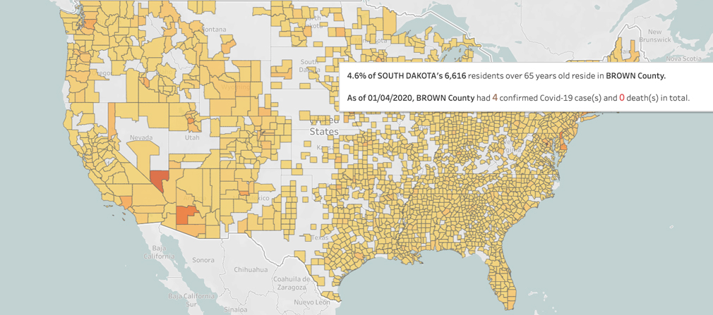
COVID-19 Spread Among the Elderly
Search confirmed cases and deaths by county for the populations 65 years and above. This dashboard also gives the total population that is 65 years and above, thus showing the risk propensity.
